
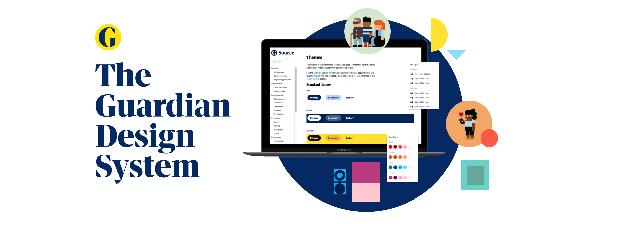
The Guardian Design System
June 2019 - March 2020
Direct contract
Scaling Source: Establishing The Guardian’s First Digital Design System
In 2019, I joined The Guardian’s digital design team following a major brand refresh. While the new identity had been defined, digital implementation across product and editorial teams remained inconsistent.
I was brought in to formalise and scale Source - The Guardian’s first comprehensive digital design system - turning a fragmented set of assets into a structured, shared foundation across design and engineering.
The challenge
Digital production at The Guardian was fast-paced and decentralised. Over time, this had led to duplication and inconsistency.
Early audits revealed:
349+ Figma components scattered across projects
11 button sizes and 14 border radius variations
Outdated typography files still in circulation
Component names varying across teams
Repeated solutions to the same interaction problems
The issue wasn’t capability — it was coordination.
The opportunity was to codify what worked, remove redundancy and create a system teams could rely on.
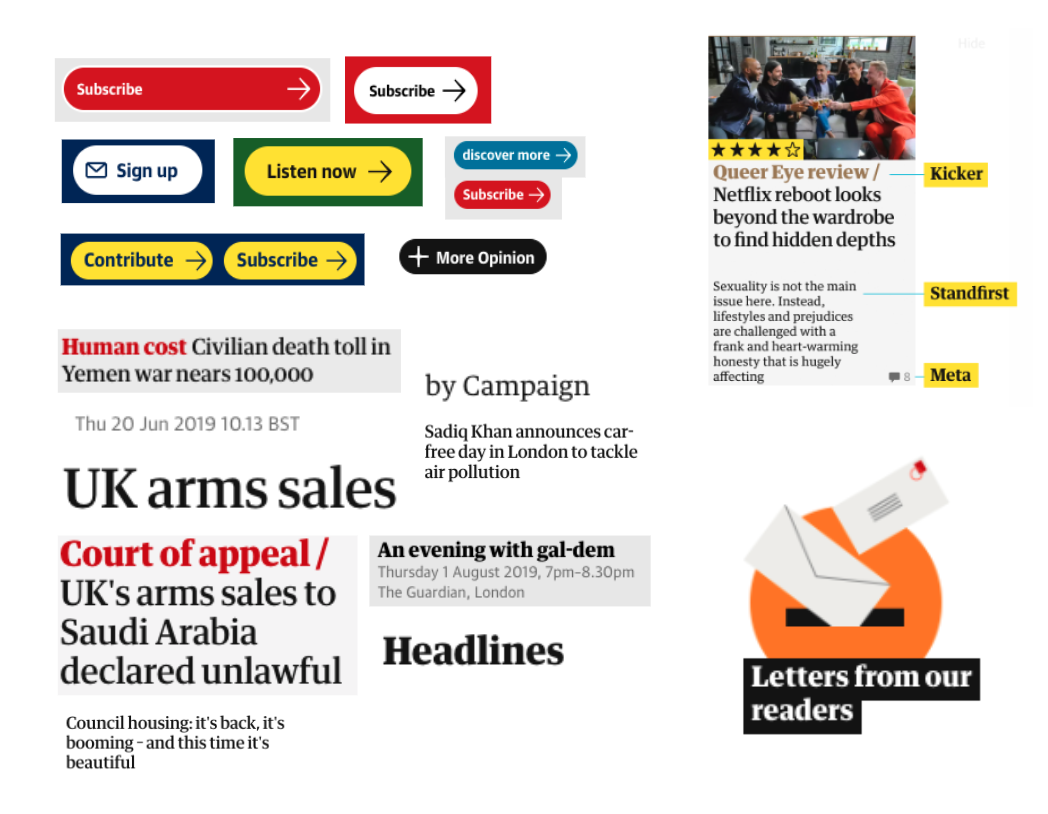
Just a handful of the styles uncovered in the inventory.
Treating the system as a product
From the outset, I positioned Source as a product in its own right.
That meant:
Defined ownership
Clear contribution paths
Accessibility standards built in
Documentation that engineers and designers could trust
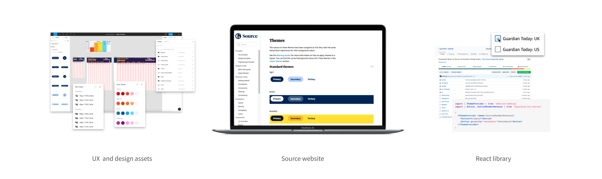
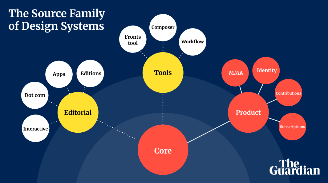
We structured Source around three core elements:
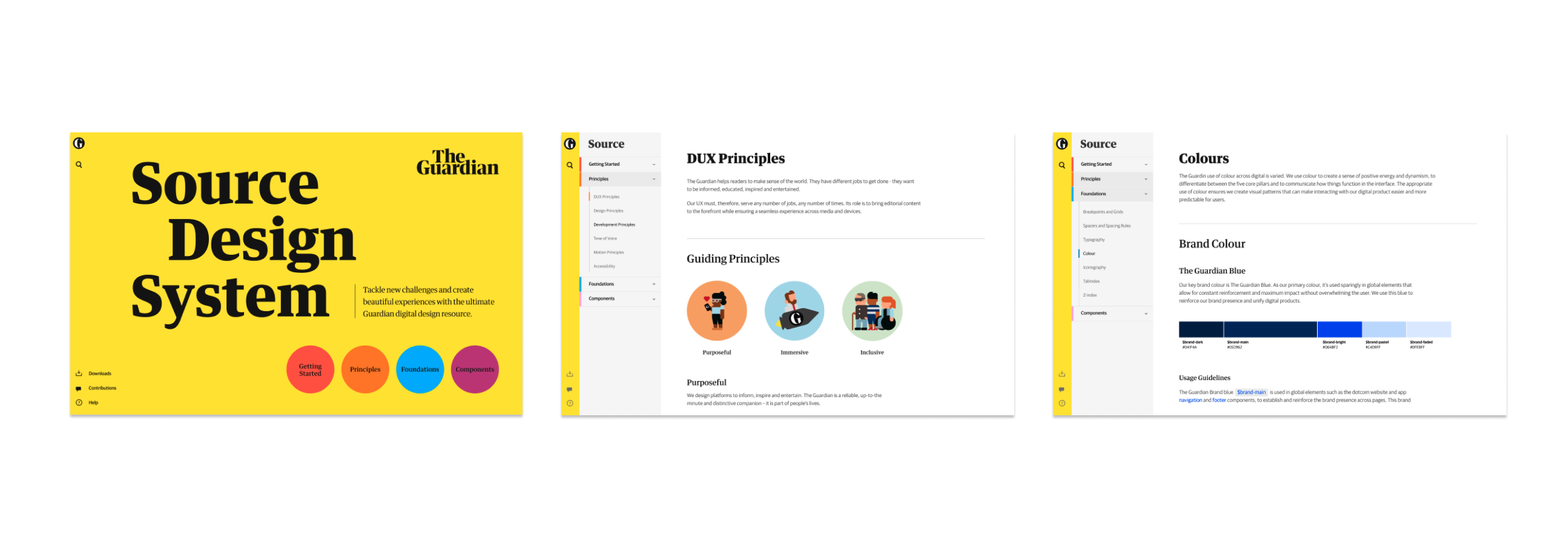
Reusable Figma libraries grounded in shared foundations
A documentation site (Zeroheight) with guidance and live examples
A React component library aligned with engineering workflows
The aim was not just consistency - but sustainability.
Introducing Source required more than building components. It required trust.
I worked closely with product, editorial and engineering teams through workshops and collaborative sessions, establishing shared language and aligning expectations around contribution.
The message was simple: Source exists to enable teams, not constrain them.
By embedding system thinking into day-to-day workflows, adoption became gradual and organic rather than imposed.


Adoption and culture
“The design system team has been approachable, open-minded and collaborative. Pairing with a digital designer on a team level feels much cleaner as we’re singing from the same hymn sheet”
- Iona (UX)
“The implementation of the CMP was completed faster because some of the components already existed, despite using them for the first time. The quality of the UI was also improved, and the UI was more in line with the Guardian design.” - Zeek (Engineering)
Process, delivery and scaling
Roadmapping and Prioritisation
Breaking down the system into epics like "Foundations," "Core Components," and "Patterns."
Definition of done
Setting success criteria for each asset (e.g., accessibility checks, documentation, responsiveness).
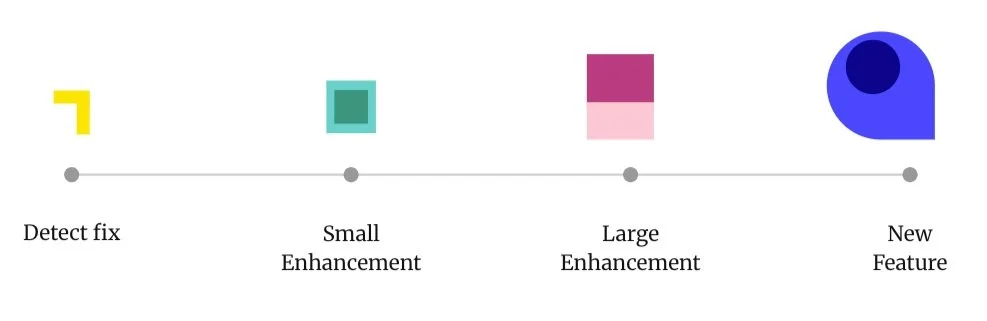
Clear contribution paths
Defining what small fixes vs large enhancements vs new features would look like.
Clear contribution paths
Syncing Figma practices with GitHub repositories and React libraries.
Outcomes and measured impact
The system gained traction quickly:
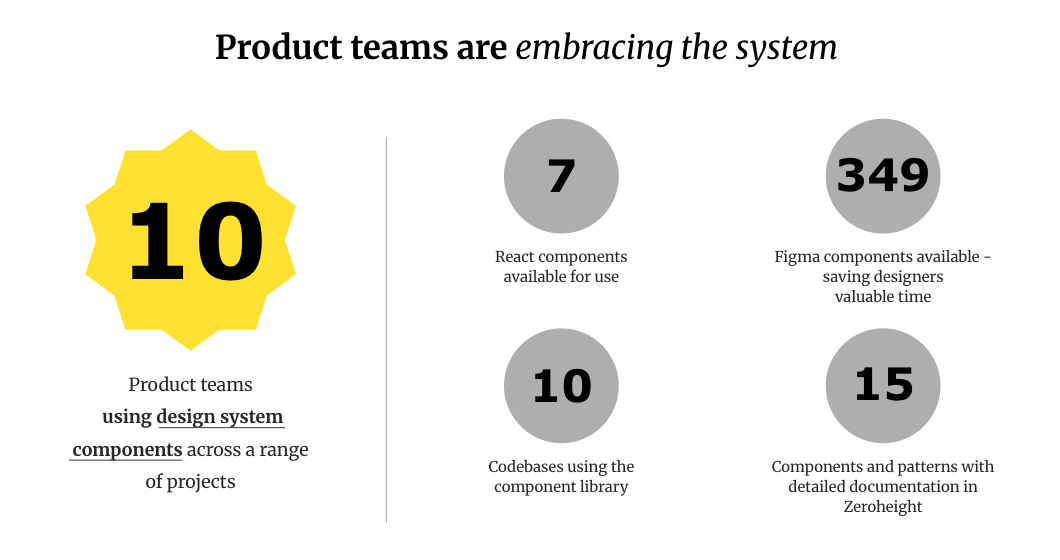
10 product teams adopted Source components
349 Figma components standardised and version-controlled
7 core React components extended across products
15 documented patterns live in Zeroheight
Accessibility standards embedded into release workflows
Teams reported faster prototyping, clearer collaboration with engineering and improved visual consistency across the site.
Governance and long-term resilience
Before concluding my time at The Guardian, I focused on sustainability.
We established:
A formal governance model
Defined contribution categories (fixes, enhancements, new patterns)
Usage tracking through documentation analytics, Figma library metrics and NPM data
The long-term vision was to evolve Source into a resilient foundation capable of supporting The Guardian’s diverse digital portfolio - from editorial features to mobile apps - without fragmenting.
Lasting impact
By the time I concluded my work on Source, it had moved from a fragmented asset library to a structured, adopted foundation across product and editorial teams.
The system introduced shared language, clearer contribution pathways and measurable standards — strengthening collaboration between design and engineering while preserving the flexibility required in a fast-moving newsroom environment.