
BlackRock
Contract: ustwo
April 2020 - November 2025
(Multiple contract extensions)
From iShares to 1BlackRock
Scaling a multi-brand design system across global investment platforms
In April 2020, I joined ustwo to lead the iShares Design System - the global foundation supporting BlackRock’s ETF business.
What began as a single-brand system for iShares evolved into a broader organisational initiative: unifying iShares and BlackRock under a shared, scalable design platform.
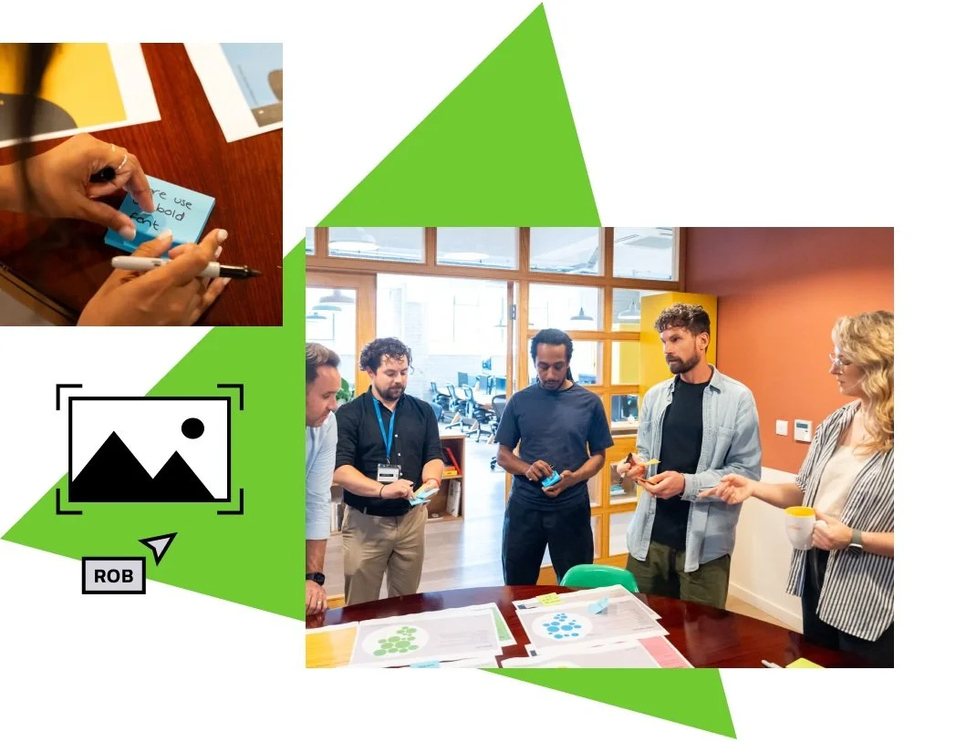
Over five years, I led the system’s strategy and delivery - aligning global and regional teams, improving accessibility, increasing design efficiency and establishing governance to support long-term growth.
15%
Increase in website accessibility rating
50%
Speed efficiency improvement with Figma design kit
4/5
InVision Design Maturity Score for iShares®

The opportunity
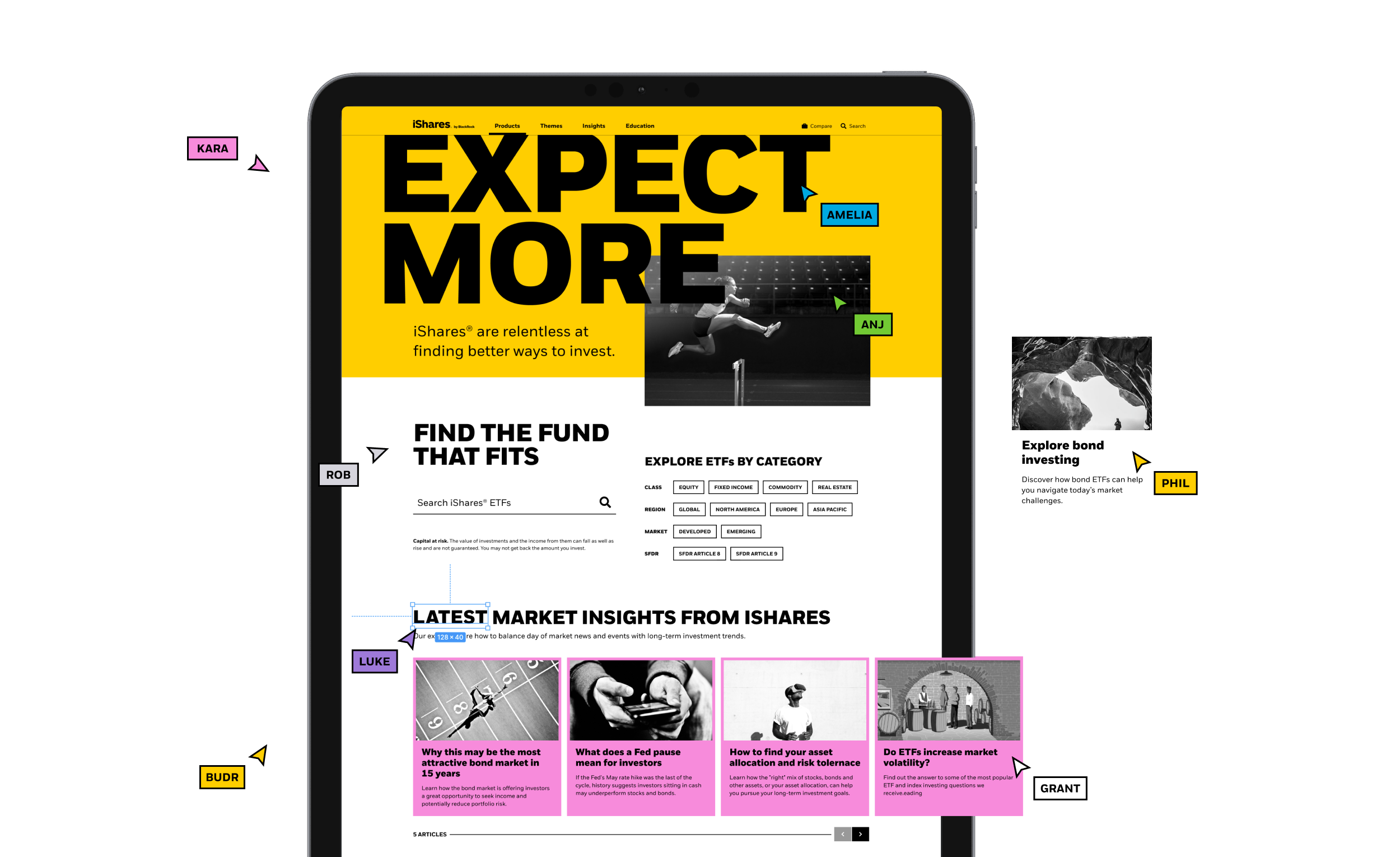
iShares had launched a new global brand identity, but its digital implementation was inconsistent across regions and teams.
As the world’s largest ETF provider, iShares operates across multiple markets, audiences and internal stakeholders. The challenge was to translate a bold new identity into a coherent digital system that could support fund comparison tools, content storytelling and regional requirements - without fragmenting.
I was brought in to lead the design system strategy and execution.
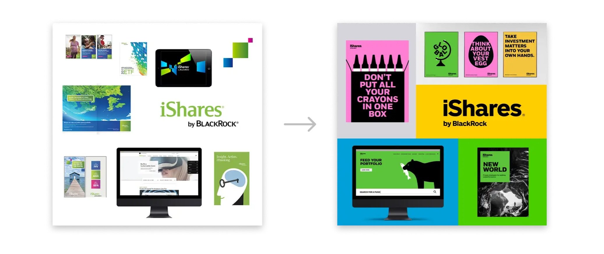
Previous iShares branding and the 2018 visual identity.
The goal
Build a scalable, accessible system that could:
Translate brand into digital patterns
Support multiple regional teams
Reduce duplication and delivery time
Improve consistency across products
We treated the design system as a product - with defined users, measurable outcomes and ongoing governance.
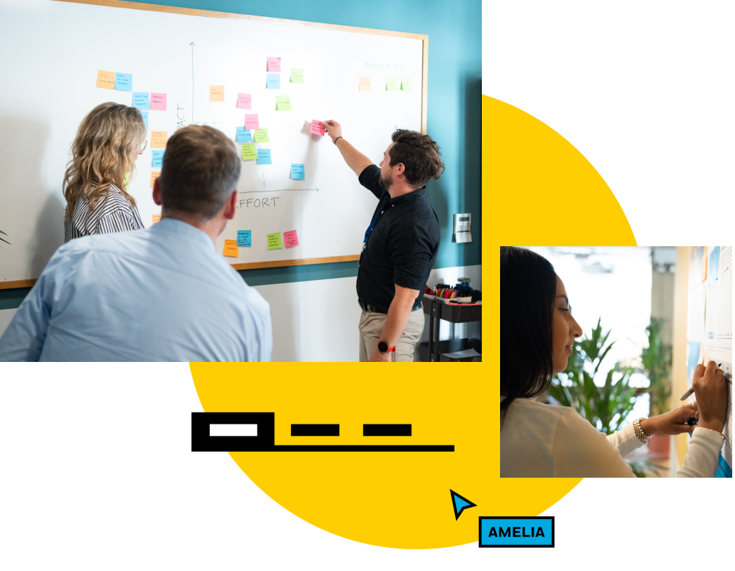
From the beginning, we treated the design system like a product that would evolve continuously to ensure future success.
It needed to be versatile and comprehensive, making it easier for teams with multiple needs and goals to create engaging customer experiences.
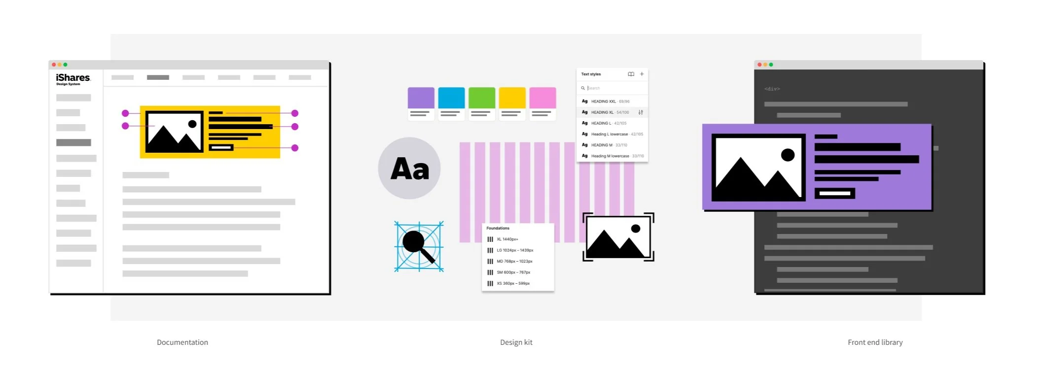
We started with three main parts: a documentation site, a design kit and a front-end library.
The approach
The system served two primary audiences:
200+ internal users
Who use the design system to complete their day jobs. Publishers, Marketers, Designers and Developers.70 global partners
Whose feedback and insight we need to create a relevant and useful design system.
We structured the system around three pillars:
A comprehensive Figma design library
Clear documentation and onboarding guidance
A front-end component library for implementation and testing
Adoption was prioritised over perfection. Education was embedded alongside tooling. Flexibility was balanced with guardrails.
Implementation
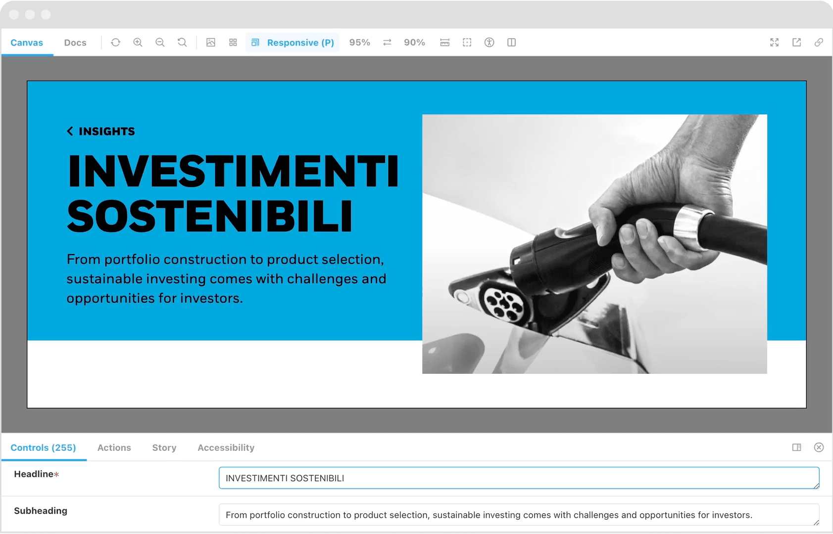
We migrated the design kit from Sketch to Figma, increasing design efficiency by 75% and improving cross-team collaboration.
Alongside the kit, we built a documentation site and front-end library to ensure teams could understand, test and implement components independently of the CMS.
The system became the single source of truth across markets.
Business impact
Accessibility
We introduced a fluid typography scale, improved grid structure and ensured semantic HTML and ARIA compliance across components. Accessibility ratings improved by 15%.
Localisation
We adapted typography and components to support regional requirements, including APAC and Japan markets - enabling consistent brand expression across languages.
Efficiency
Standardised components reduced duplication and accelerated delivery, allowing teams to release updates and content more quickly and consistently.
Expanding to the 1BLK Design System
As the iShares system matured, the scope expanded significantly.
The work evolved into a broader initiative to unify iShares and BlackRock under a shared foundation - internally known as the 1BLK design system. This required reconciling two established brand ecosystems, aligning legacy components and introducing governance capable of operating at a much larger organisational scale.
The system transitioned from supporting a single ETF brand to underpinning multiple product lines across the wider BlackRock business. This shift was not simply visual. It represented a structural move toward greater usability, scalability and cross-brand consistency - ensuring teams across the organisation could build within a coherent framework.
What began as a focused design system became a strategic platform initiative for the broader business.